INTRODUCTION
The Covid-19 Pandemic has been a globally life changing experience, and it continues to persist. With annual surges in infections,
and constantly mutating viral strains, monitoring Covid-19’s patterns is of recent priority.
In an effort to predict upcoming infection rates from Covid-19, the CHIME application (Covid-19 Hospital Impact Model for Epidemics)
was developed to anticipate necessary hospital capacities during infection peaks. The application uses a scripted prediction model
which categorizes population data into groups called SIR (susceptible, infected, recovered), in order to recommend needed hospital capacity.
This project uses three different models to make projections based on data collected by the regional health authority of British Columbia,
Canada, from March 23rd to March 30th, 2020. The window of time for data collection was chosen due to a higher influx of Covid-19 cases in
the British Columbian region at that point in time.
Utilizing ArcGIS Insights, I used the SIR, Census and Admin models to make combined projections of Covid-19 cases. In order to do so, I
scripted the models into the Insights interface in order to create different visuals for these predicted infection patterns of Covid-19.
Here are my results.
Part I: Regional Health Authority Data Overview
The data used as a base of the Covid-19 projections separated British Columbia into five different regions: “Fraser,” “Interior,”
“Vancouver Island,” “Northern,” and “Vancouver Coastal,” (see figure 1.1), and were stored under the classification of “countyname.”
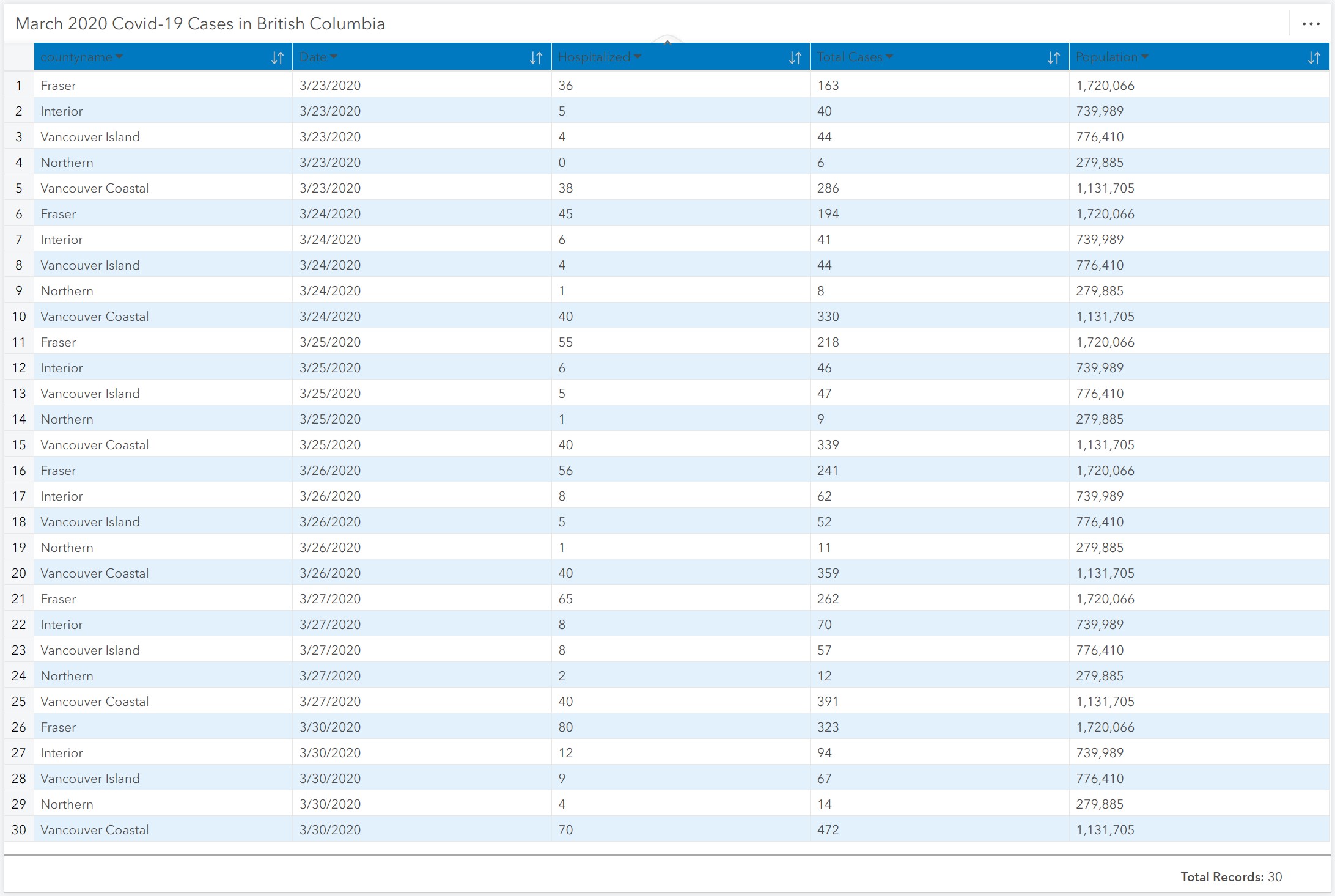
The Regional Health Authority dataset collected data from those regions can be seen in table 1.1. More specifically, they cross referenced
the Canadian regions with their populations, total cases, hospitalizations and dates of infection.
The data clearly shows that on average, there is an increase in Covid-19 cases across all regions. Between March 23rd and March 30th,
Fraser, the region with the largest population, had a 98.16% increase in total cases. Similarly, the hospitalizations in the same region
more than doubled, increasing by 122.22%. These numbers are consistent even among regions with the smallest population, such as Northern,
whose total Covid-19 cases increased by 133.33%.
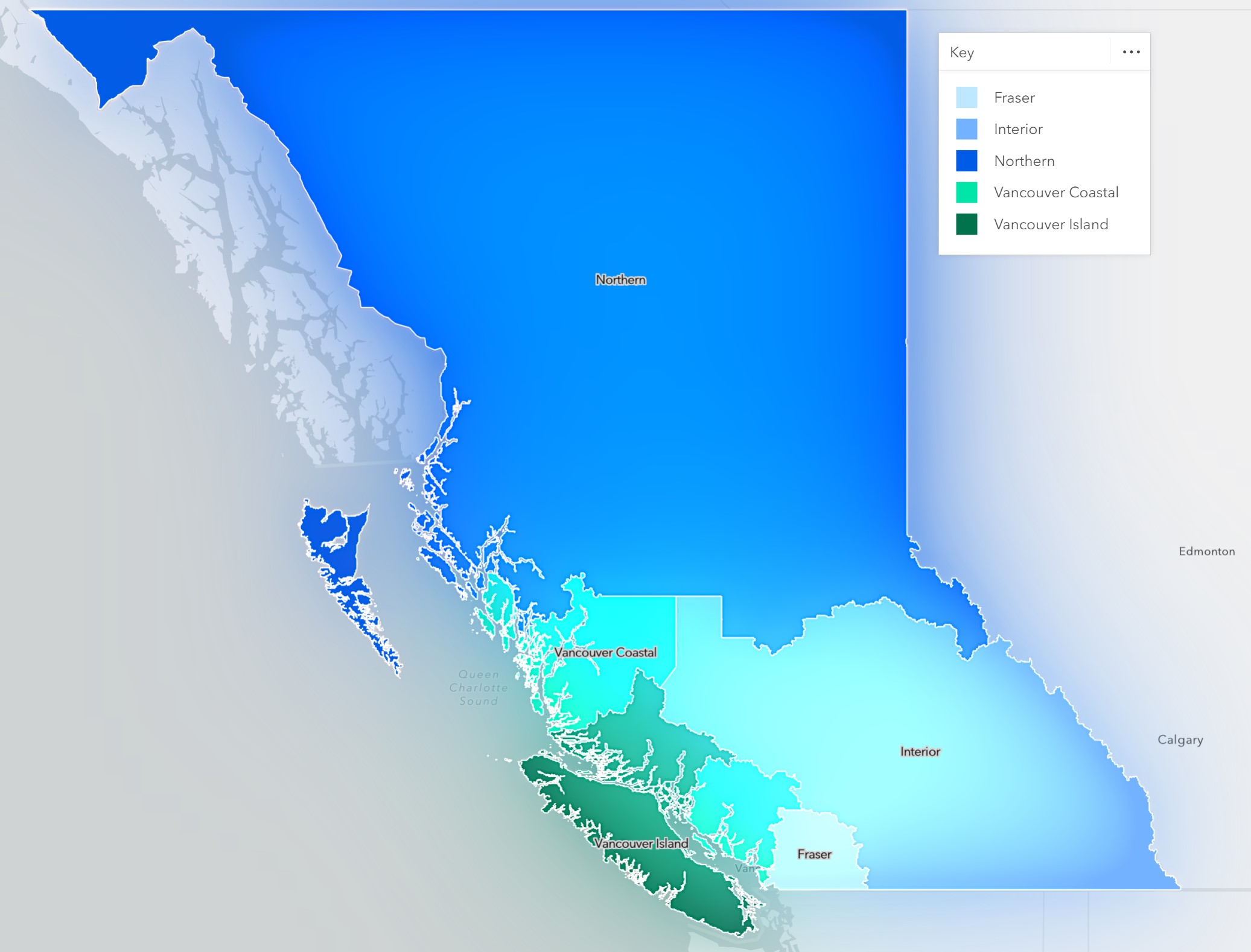
Figure 1.1 Map of territories in British Columbia, used to chategorize data regionally.
Table 1.1 Simplified Regional Health Authority's Data
Part II: Covid-19 Prediction Results
After analyzing the initial input data further, I scripted the three CHIME prediction models into ArcGIS Insight’s coding module.
In Figure 2.1, we can see the code used to script these models, by first defining the SIR variables, and running projection functions
through the existing data to create the predictions.
The CHIME model uses its own global pandemic data parameters, to cross reference with the input data to make current predictions.
More specifically, the results focus on the infection trends between September to December 2023, in the same British Columbia Regions.
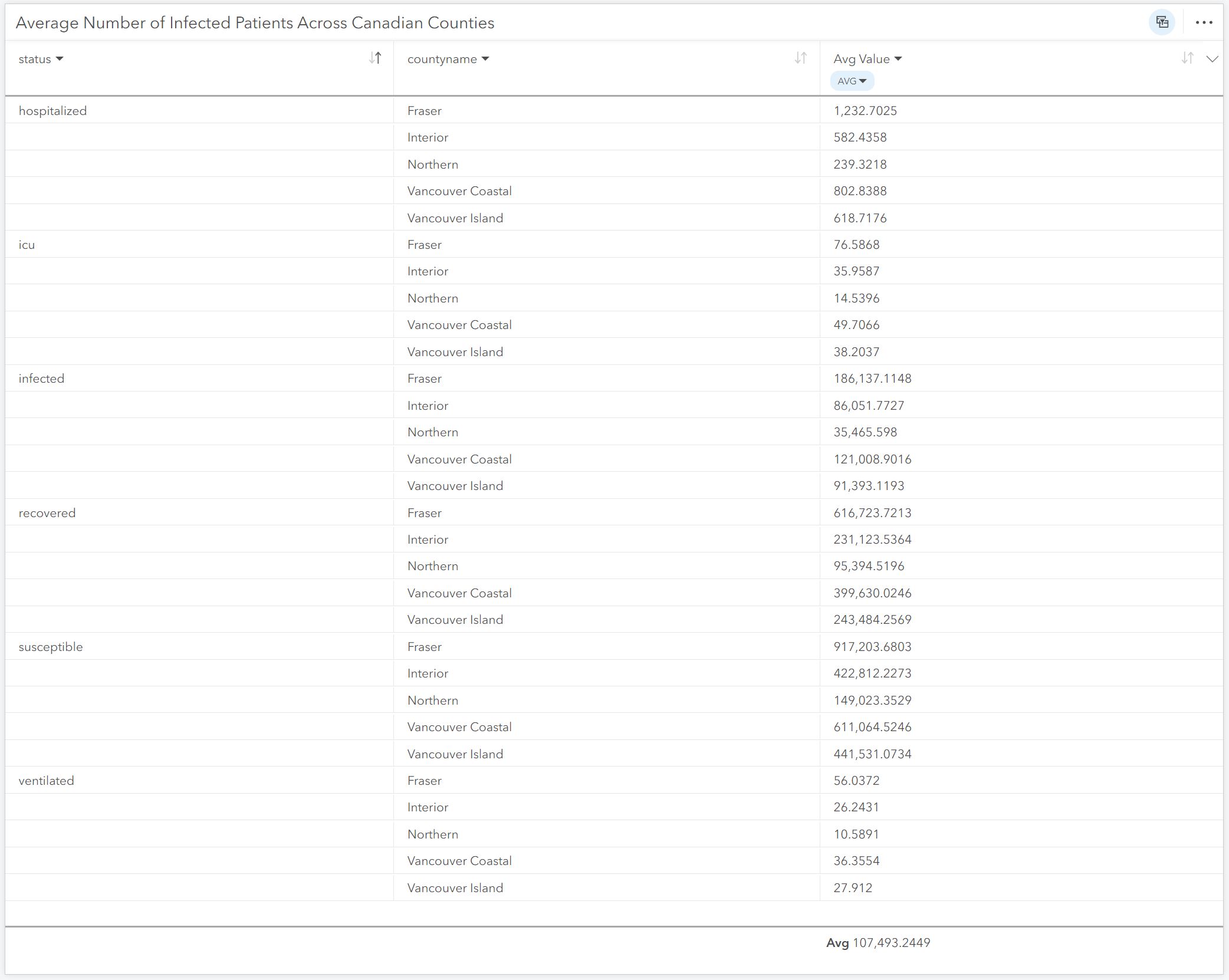
The model then groups the cases into the SIR categories: “Susceptible,” “Infected,” and “Recovered.” In order to provide hospitals with
further useful information, the “infected” data is then sub categorized into “Hospitalized,” “ICU,” and “Ventilated” variables, which
are overlapping. In Table 2.1, we can see that the average number of people who are predicted to be infected between September and
December of this year reaches the thousands in every region. For example, the average number of infected people in the region with
the largest population, Frasier, is 186,137.11, which is 10.82% of its 2020 population. Moreover, the predicted number of susceptible
citizens of the same region consists of 53.32% of their population. While these numbers are seemingly intimidating, the predicted
number of recoveries is far higher than any other category, reaching 616,723.72 in Fraser.
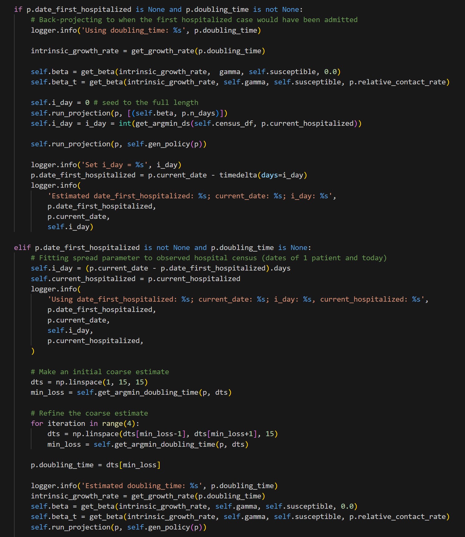
Figure 2.1 Portion of Python code used to script in ArcGIS Insights, displaying the initial prediction model codeing process
Table 2.1 Average predicted number of Covid-19 cases, separated by region and infection status
These numbers are relatively consistent across all regions. To visualize those comparisons across regions, I created a pie chart map seen in
figure 2.2 and figure 2.3. The pie charts show the general analyzed categories of the prediction data across the British Columbian regions.
Note that the combined prediction models are labeled as “BC_Regions_Model.” Here we can see the comparison of predicted infection cases (which
does not overlap with hospitalizations) between the most and least populated regions.
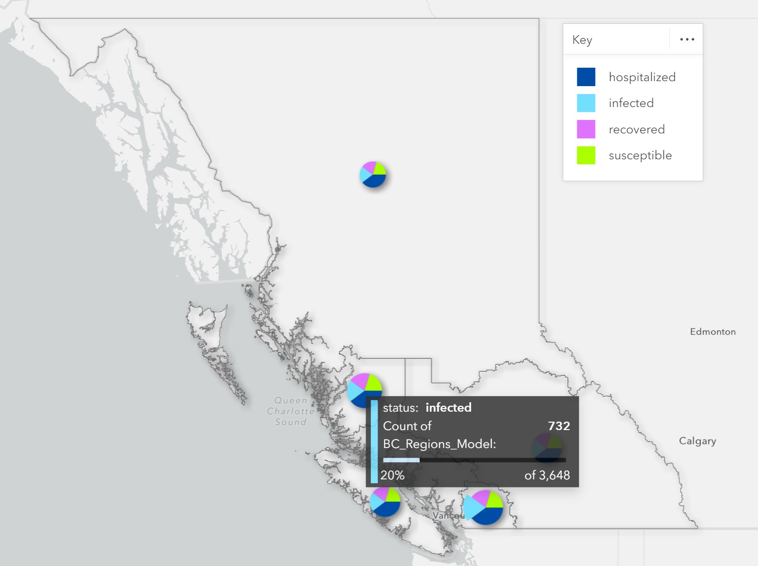
Figure 2.2 Pie chart map of infection status, highlighting Fraser's predicted infection count
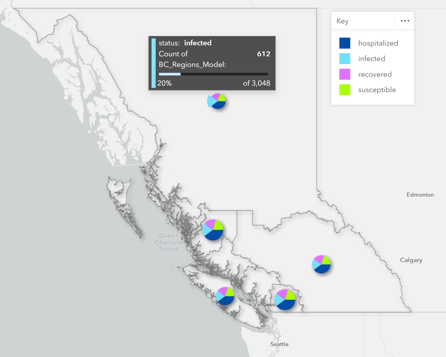
Figure 2.3 Pie chart map of infection status, highlighting Northern's predicted infection count
The final, most useful, visualization displays the average predicted values of the same four “status” categories, over the next four
months of 2023. As seen in figure 2.4, the average number of susceptible people across all regions is significantly higher than any
other category, reaching a value of over a million. At the same time, the infection, hospitalization and recovery estimations are very
low. What this tells us is that August and September are prime months for Covid-19 incubation. More specifically, as Covid follows
common viral patterns of infection waves throughout the year, high susceptibility levels imply the beginning of a new wave.
This is corroborated by the data in figure 2.5, where susceptibility is predicted to plummet, converging with rising rates of infection and recovery.
This crossover implies that we will see the most active effects of Covid-19 in early November. While people will be generally less susceptible to the
virus, we will also see an influx in the virus’s activity. As we can see, hospitalizations rise significantly less than the other two categories.
This proves that while the virus is still prevalent in our daily lives, it is far less fatal than it used to be at its inception.
Finally, as shown in figure 2.6, by December 2023, it is predicted that the susceptibility and infection levels will decrease significantly, while
recovery rates will rise. Within the last month of 2023, the number of infections are anticipated to have dropped by 87.29% on average. This clearly
marks the end of this year’s Covid-19 viral wave.
Calculating the predicted viral trends of Covid-19 might not seem relevant anymore because of its decrease in severity. Nevertheless,
this type of data is critical for anticipating the resources and alternative preparation necessary for dealing with such an illness.
Just like the Flu, Covid continues to mutate and return in waves throughout the year. By creating prediction models for its patterns,
we can become more accustomed to its trends, thereby attempting to manage the viral spread and potential fatalities that could result.
Watch my full process of scripting and creating the basic data visualizations in ArcGIS Insights:
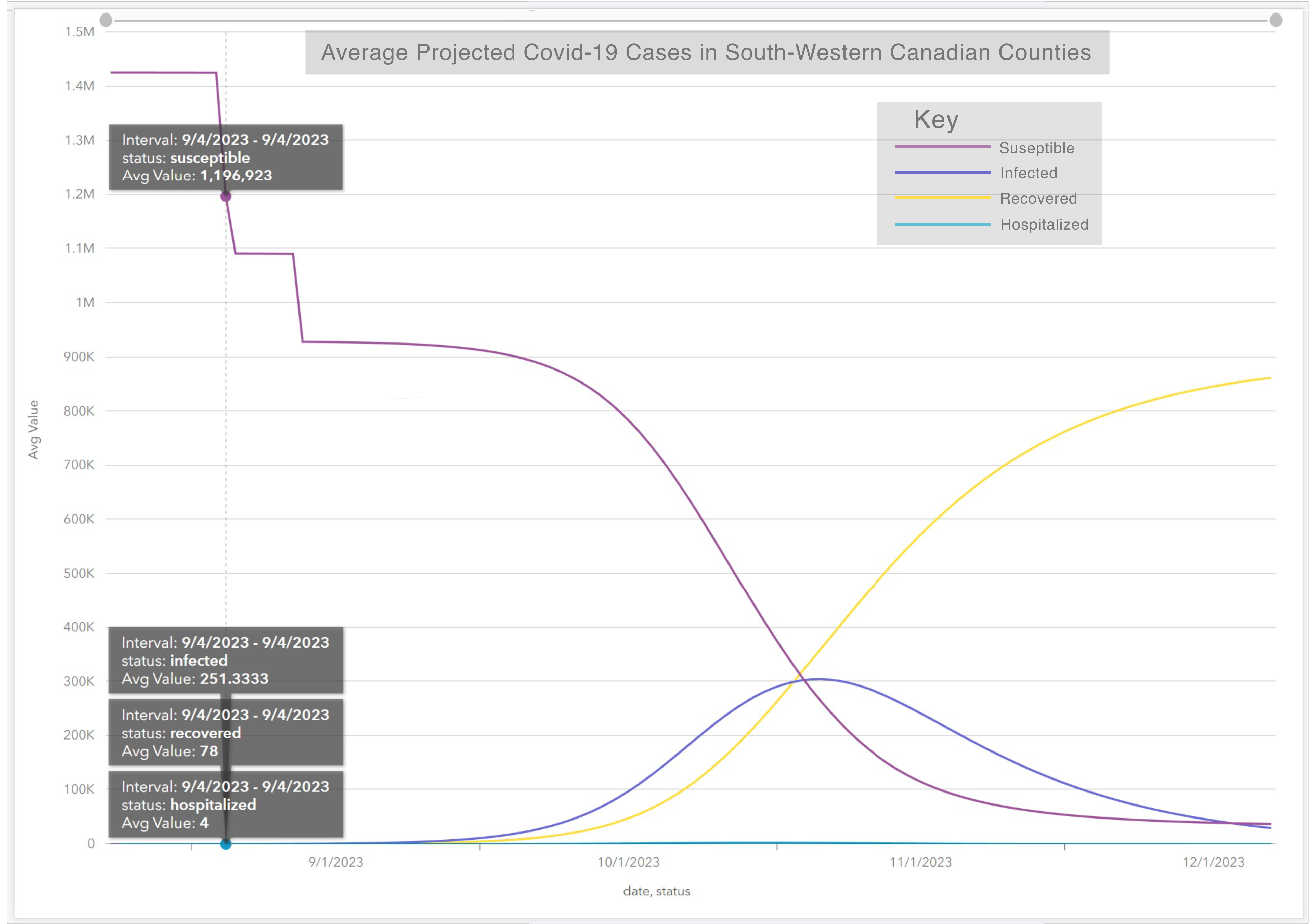
Figure 2.4 Average value of projected Covid-19 status over time, highlighting September case numbers at suseptability peak
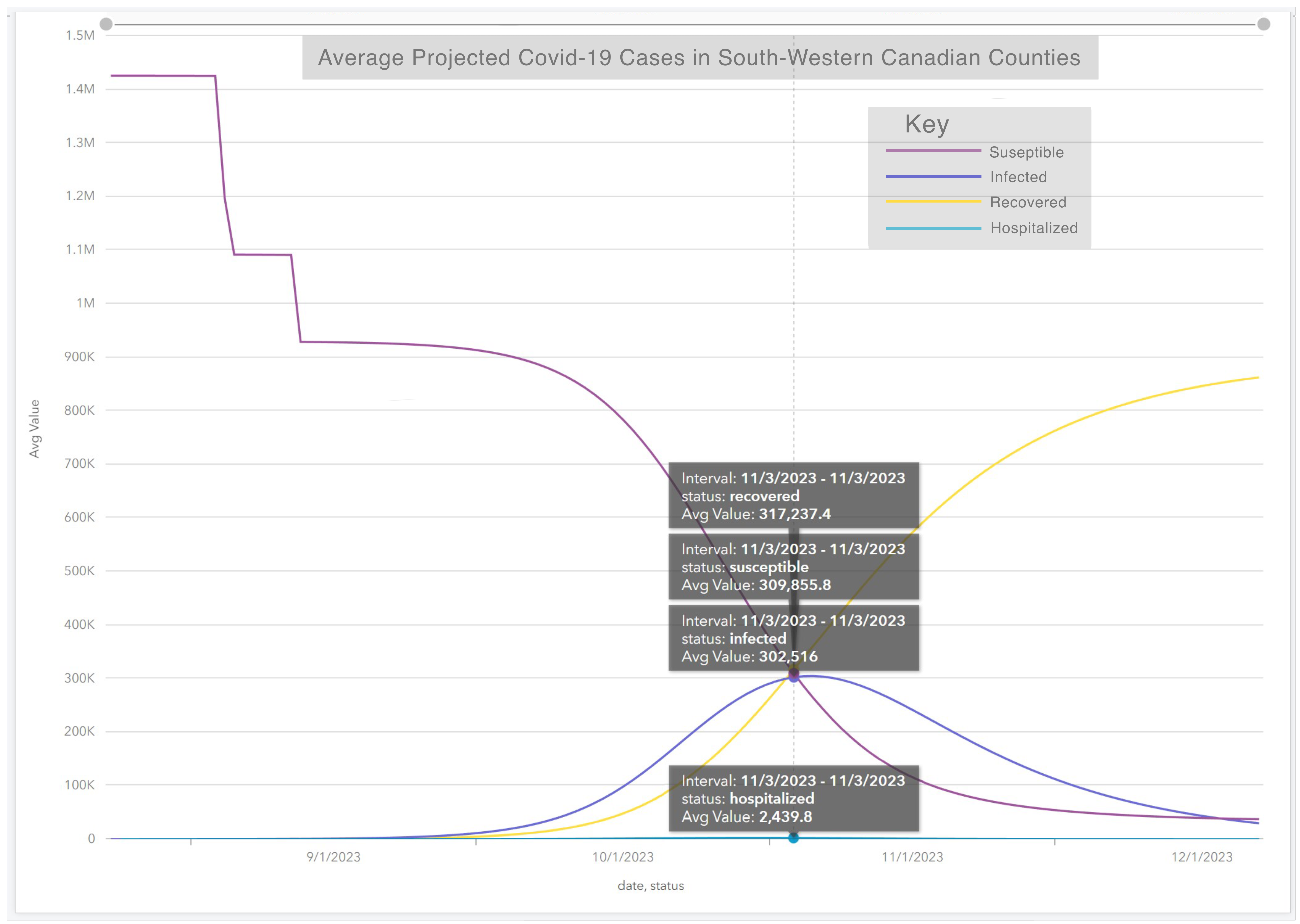
Figure 2.5Average value of projected Covid-19 status over time, highlighting November case numbers at status crossover
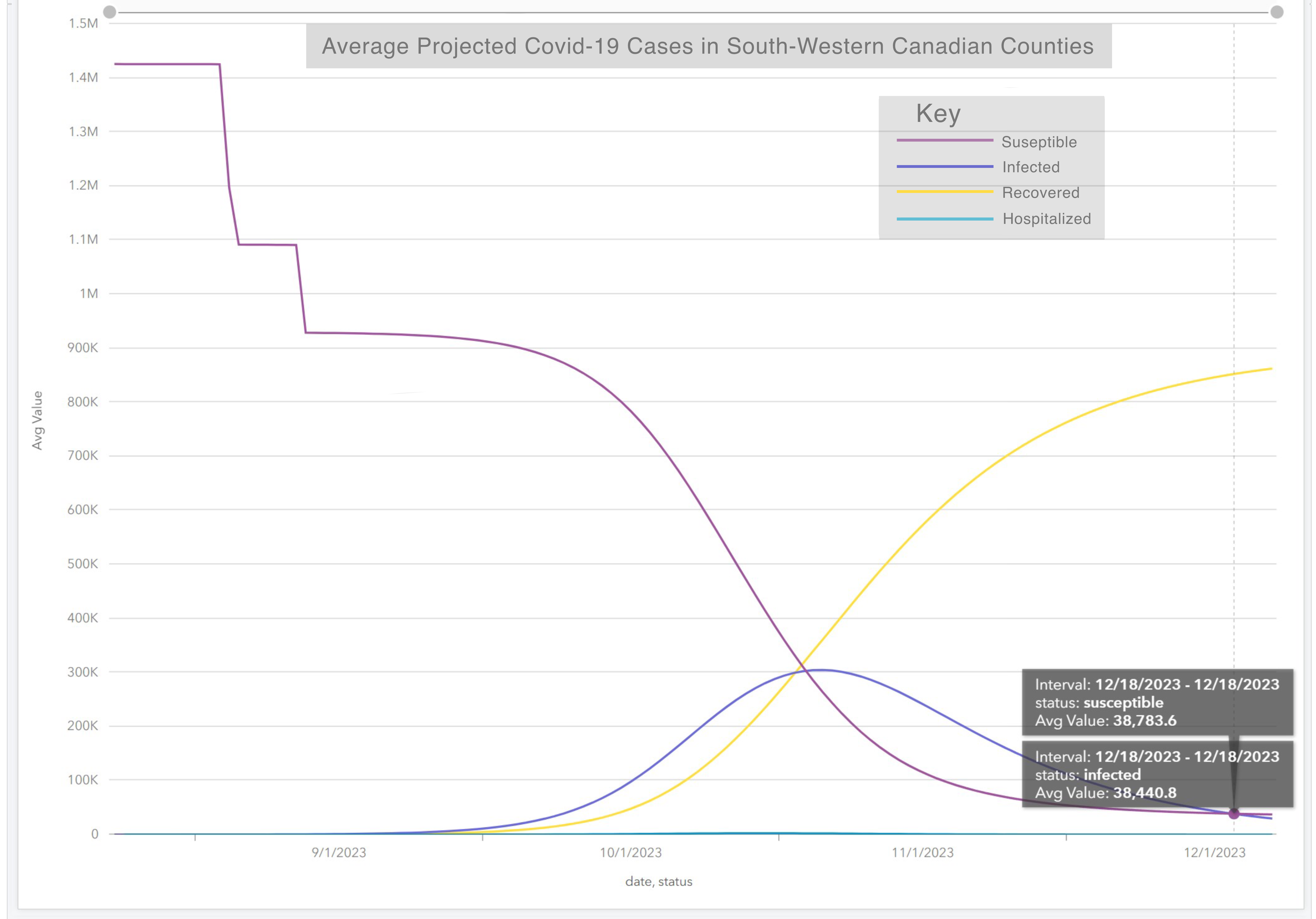
Figure 2.6Average value of projected Covid-19 status over time, highlighting December case numbers at infection low
Resources:
-ArcGIS tutorials and datasets - https://www.esri.com/arcgis-blog/products/insights/analytics/use-chime-arcgis-insights/
-Github Insights resourses - https://github.com/Esri/insights-scripting-guide
-Prediction interpretation resource -https://code-for-philly.gitbook.io/chime/what-is-chime/dashboard-outputs-descriptions
-Penn State CHIME model and SIR data details - https://penn-chime.phl.io/